Friday 20 April 2012

What do you feel you have learnt in the progression from your Preliminary Task to your final product?

This is the front cover of my preliminary task, even though this is a school magazine and the image below is a music magazine, so they are quite different, however, I still managed to compare some of the features fomr both of them.
First of all I am much prouder with my main task than my preliminary. Looking at it I have realised I missed off a lot of key features to attract my audience and also there is way too much empty space for a front cover. I have used only one sell line and the title is not at all interesting, these are two of the main features that are meant to draw your reader in. I do not even have a banner which is unheard of on a magazine, not only this I don't even include a burst anywhere on my front cover. The black background is dull are meant I couldn't use different coloured fonts, I could only use white. This in itself is not a good technique as it makes the magazine look boring and unappealing. The two things I like about this are my tag line and the use of direct mode of address, where the model is looking into the camera lens, other than that I am unsatisfied with this piece.


In contrast to this, my main task, a pop music magazine has a completely different look altogether. It is clear to see that I have progressed well and I have learnt more about how to lay out my cover properly and conventionally. The cover looks a lot more cluttered and I have used obvious things such as, a burst, banner, bright colourscheme, different fonts, all conventions that pull together a professional magazine. The title on my main task is significantly better, I have used three different colours, a bigger font, and I have also put it at a slight slant which draws the readers attention even further.
This image is a normal a4 size, but unfortunately it uploaded into a different size and I couldn't figure out how to change it.


The contents page for my preliminary is not at all conventional and the background for starters, of a brick wall, immediately gives the reader a boring outlook on the magazine. Going from a black cover to a brick wall on the contents page isn't exactly appealing for the audience. I think this is where I learnt a lot about how to keep the reader interested, because if I was readiny my preliminary magazine I would of more than likely skipped the contents, whereas on my main task I have used a large font and and ellipsis which make the reader want to read the page. I know now that with a contents page, images are EVERYTHING and I certainly didn't use enough images, the one I have used should of at least used direct mode of address to give a little more of a personal feel. Comparing my preliminary contents page to my main one, I have decided I am very happy with my final music magazine contents page as I have used a lot of conventional features.     

So to conclude, I have definitely learnt a lot since my preliminary task about   making a successful magazine, my final drafts are significantly better than my preliminary task so all in all I am very happy with my work. I think it is clear to see just how much I have learnt by simply looking at my work.
All that I have learnt has affected me drastically from comparing my preliminary task to my final task visually. Not only has it made me realise how much I have progressed but also just how much detail is needed to make my work the best it can be. 


The main thing that I think helped me progress so much was learning how to research properly and to find the exact information I wanted. I realise now, looking back, that the 'research' I carried out when making my preliminary task was nothing compared to what I needed to do to make a successful final piece. Research is key because it is where magazine companies find out all the vital information about your audience that you need to sell your magazine.
I have created a media text which means I am a gatekeeper, this means I control the information that I give to the audience therefore I am letting them see what I want them to see.

What have you learnt about technologies from the process of constructing your media product?

How did you attract/address your audience?

In what ways does your media product use, develop or challenge forms and conventions of real media products?

The Front Cover
First of all, the main way in which my media product uses conventions of a real music magazine is by the style model I chose, 'We Love Pop'. I thought that sticking to similar conventions and using the same kind of features as they do for my magazine would be key in helping the magazine to look professional yet unique at the same time. 

The bright colours and bold fonts are very conventional in pop magazines, they help to make certain aspects of the cover stand out more than others, usually these will be sell-lines and mastheads as these are the features which draw the reader in immediately. I made the title of my cover very similar to that of 'We Love Pop' as I felt that this was a very effective feature and would make my magazine look more realistic. I also felt that keeping a consistent colourscheme throughout my cover, contents and double page spread would allow the audience to associate the colours with the magazine as we already do so, e.g 'Top of the Pops' is very girly and uses pinks and purples often.
As the style model 'We Love Pop' was quite cluttered but not too over the top I decided to try to re-create a similar feel for my magazine. I did this by scattering my sell-lines all over the page and slating them slightly to give the magazine a more interesting look, I also made all the sell-lines the same size as I didn't want them to stand out more than the title or banner. 
I used a banner for my magazine as I felt like this would help my article to stand out from all the other features on the front cover, I felt that making my double page spread clear would allow the reader to easily see what the main feature is in the magazine which is generally a very important convention in pop magazines. 
I added a prize giveaway in my magazine which I tried to make slightly more noticeable by placing it at the top of the page, I did feel like this needed to stand out as it gives the magazine a bigger attraction. 
I placed the 'BBC' logo in the top left-hand corner of my cover as I felt like this would be a good way of making my magazine look more authentic and real, having a logo on the front cover is a very common convention of pop magazines, in fact I haven't seen any without it. 
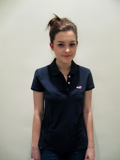
The main image is typical of that of a pop music magazine, it is a mid-shot of a young female pop singer, she is using direct mode of address by smiling into the camera lens therefore making the magazine seem real.
I don't think I have challenged anything on my front cover which is what I didn't want to do, pop magazines are all similar and presented in a certain way for a reason, which is that their audience like it that way and any drastic changes/challenges could affect the sales of the magazine itself. 


The Contents Page
My contents page is probably the most conventional part of my project. I decided that it would make no sense at all to stray away from typical forms and conventions of a contents page as it could make the page useless in the magazine. 
The first thing I did was to stick with the exact same colourscheme as I had on my front cover as I felt like this would make the magazine look more consistent and professional. This is used in all other pop music magazines so this is why I chose to follow the same route. 
The title of the contents page is 'What's Inside...' which is conventional as no pop music magazines just use the words 'contents page' purely because it seems boring and therefore would not give them the urge to read the page. Whereas, I have used an ellipsis at the end of my masthead as do some real pop magazines, this makes the reader carry onto the next part of the page therefore meaning they will read the whole contents page. 
I took a screenshot of my magazine cover and stuck it onto my contents page and after adding arrows to the page number each feature on the cover is located. This is a very eye-catching and conventional feature as it is one of the first things the reader sees on the page. 
Pop magazines also have some other things located on their contents, for example, on mine I chose to add a 'Hot Right Now' section in the bottom right-hand corner of the page as I felt like a section just of pictures of girls favourite male artists would most definitely draw them in.
I added in a letter from the editor which I felt was very conventional and told the reader exactly what to expect from my magazine. 
Having the page number located at the bottom of the page also helps to make the magazine look more real/authentic.


The Double Page Spread
I chose to do my double page spread of a new male pop artist who has just entered the pop industry. The double page spread used in 'Top of the Pops' featuring Justin Bieber was my main guide when making my spread. There are several images used on it as I felt this is a good way to keep the reader interested in an article.
I have used a different colourscheme for this part of my work as I felt like this needed to be quite separate from the cover and contents. The title is in direct quotations which I feel makes the reader feel as if they are already getting a 'sneak peak' of what's to come in the actual article. 

Eventhough I have used slightly different colours for my double page spread they are still bright, bold and quite girly, this stills keeps a sense of consistency throughout the magazine, therefore giving the magazine a nicer physical appearance. I used a bright red colour occasionally which did actually help to make certain aspects of the spread stand out much more than others do.


Monday 9 April 2012

What kind of media institution might distribute your media product and why?


I had to choose between two different media institutions, the first being BBC Magazines and the second being Devlopment Hell LTD.


The first institution I thought would be the best distributor for my magazine is BBC Magazines, this is because they have a lot of experience in attracting my target audience. However, after analysing this and Development Hell LTD I decided that Development Hell LTD would be the best distributor for my pop magazine. You may find this strange but as they have never distributed a pop genre I believe they will pay full attention to my target audience and they will be able to focus fully on making the magazine successfully drawing them in. Even though they haven’t got much experience in distributing pop magazines or attracting my particular type of audience, the magazines they currently distribute are extremely successful. If I chose BBC Magazines I think it could eventually cancel my magazine out and only distribute a few issues as BBC Magazines already distribute the most successful pop magazine, Top of the Pops so it would be very difficult for my magazine to compete with Top of the Pops.


The second institution I thought of using is Development Hell LTD, this is because they are one of the most successful companies in the UK. However, they do not distribute any current pop magazines, I thought this would be interesting as it would give them a new and different way to distribute a magazine. Development Hell LTD distribute one of the most popular dance magazines in the UK called MixMag, this made me feel more comfortable as dance is very similar to pop and many of the artists featured in dance magazines are also often featured in pop magazines too. I thought that as Development Hell LTD already distribute a well-known and successful magazine then they should be quite reliable and are therefore a very good choice to distribute my magazine.

Sunday 8 April 2012

Evaluations!

Now that I have finished my main task, I will begin my evaluations!

Final Draft of Double Page Spread


This is my final draft of my double page spread for my magazine.


This is the style model I used when making my double page spread.


Contents Page Final Draft

This is the final draft of my contents page for my magazine.


Wednesday 4 April 2012

Final Front Cover Draft


This is the final draft of my front cover for my music magazine.


I think my front cover has improved dramatically since my first draft, I have made a significant number of changes to this cover which I found from my feedback. I used the magazine 'We Love Pop' as a guide as I really liked the whole theme and layout of the magazine. These are all the changes I made;

  • I found a magazine that I could use as my style model, this was key in helping me to create a successful final draft
  • I chose some different colours, because even though people said they like the colour scheme I had, I felt like these were bolder and nicer
  • I enlarged the font for my title and also changed the name of my magazine to something shorter
  • I added plenty more images on the cover, as this was one of the things my target audience and I both picked up on
  • I made the cover look more cluttered as I had too much empty space on my first draft which made my magazine look boring and not conventional
  • I made sure I added a bar code onto the cover as this makes it look a lot more conventional
  • Also, to add next to the bar code I put the price of the magazine on the cover too, as I realised after my feedback that this was quite a big issue
  • I changed the font on some of my pages, I did this because it adds interest for the reader and makes the pages look better
  • I added a page number on my double page spread as I realised this was an obvious convention which is small but would still be noticed

Wednesday 21 March 2012

Feedback from my Target Audience for my First Drafts

First of all, before attempting to make my pages better here is the feedback I talked about in my previous post for my first drafts. I asked people how they thought I could improve.

"I am finding this difficult as I do not have a real magazine to compare it to but, I like the bright colours as I think they are very girly and eye-catching. I think you could use more pictures as I like to see magazines full of pictures, they make me want to buy them."

"The title could be a lot bigger as I think this is one of the first things I see when I look at a magazine, also the images should be larger too this is what I normally see on magazines so you should stick to conventions and make them bolder, I do like the colours"

"The colours are very engaging, I noticed them straight away, I was a bit worried about the fact there was no price on the cover as this is one of the things I usually look for on a magazine! Also The page could be more cluttered as I do not see enough images and sell lines"

"I think to make it look more conventional and realistic you need to add more features and images, also sell lines are key to me when I'm buying a magazine"

"I think the colours are great, I don't like that there is no price as I would be worried that it might be too expensive and I wouldn't have enough money which would be embarrassing"

" I like all the colours but I do not like that you have used the same font for everything, I think you should mix it up a little more and add more images, I think this would help your magazine to look real and therefore sell easier"

"Your double page spread does not have enough images, I think that because it is an interview you definitely need lots more pictures to make it more interesting"

"I really need something to compare these to, I'm not too sure about the images you've used, I think they are quite boring and there are certainly not enough, magazines need to be cluttered and jam packed full of interesting information and pictures"


All of these comments really helped me to know what to change and what to add to my pages to make them more engaging and conventional;

1. Add more images and sell lines, as these will help to catch my readers attention
2. Add a bar code and price
3. Make sure my title is bigger and bolder
4. Make sure that there are varied fonts to keep the reader interested. 

Tuesday 20 March 2012

Improvements!

As I have already mentioned I definitely need to improve a lot for my next drafts! 
I need to produce my contents page, add plenty more images so to do this I will have another photo shoot.
I feel that there is a lot more I can add and tweak to these pages to make them much more eye catching for the reader. I will be showing these images to some of my target audience to see what they would like me to change about them. 

Monday 19 March 2012

First Draft of Double Page Spread


Again, due to the fact that I did not use a style model, I feel that this can be improved dramatically. First of all, I have not used enough images at all, double page spreads are all about using imagery to attract the audience and encourage them to read the features, not only this, I have chosen to do an interview for mine and they generally come with a photo shoot of the star. Secondly, I have not used a page number and quite frankly I have not used enough conventions to make this magazine a success.

First Draft of my Music Magazine Front Cover


This is my first draft of my front cover. I rushed this so I am really not too happy with it and I can assure you that my final draft will be much much more improved! There are a few things I do like about it, firstly I think the colours cheme is typical of that of a pop magazine, the colours are bright and girly which will draw the audience for my magazine in. Secondly, the banner is conventional and i feel it is an important when making a pop music magazine. 
The things I have not included which I will in my next draft are;


  • More images
  • Bar code
  • A bigger and bolder masthead
  • Price
  • More features to draw the readers attention

Also, the fact that I didn't use a style model is a big problem so for my next draft I will be making sure that I stick to conventions properly.

Saturday 17 March 2012

Focus Group

I thought that a focus group would be a great way to find out what my target audience would love to see in my magazine. I asked 4 small groups of girls of the same ages, 13, 14, 15, 16, as this is the age I have chosen to aim my magazine at. This seemed the most fair way of including some things which each of the ages included in my audience would want in my music magazine.
These are the things they all said;

13 year olds;
  • wanted a female celebrity featured on the front cover
  • competitions
  • quizzes
  • games
  • list of chart songs
  • some said an 'oops' section where people can write in to tell their embarrassing moments


14 year olds;
  • agony aunt 
  • boy advice
  • quizzes&competitions
  • interviews of celebrities
  • posters
  • chart music


15 year olds;
  • new and upcoming artists
  • celebrity advice
  • competitions 
  • agony aunt
  • boy gossip
  • chart updates of the week
  • fashion page


16 year olds;
  • features on boy bands/solo artists
  • where to buy actual items celebrities are wearing
  • Interviews
  • competitions
  • what's hot(fashion wise)
  • agony aunt
  • chart songs


I found that competitions appeared in not just one age group so this  will definitely appear in my magazine.

Friday 16 March 2012

My Design Philosophy

The Four F's are going to help me to decide what I would like my layout to look like and what I will include in my magazine.


  • Formula-the articles and features that go in the magazine should remain in the same style each week. This is not something I will highly consider as I am only making one edition of the magazine, however I could apply this to the type of articles I will include in my magazine.
  • Format-the design and layout and what the magazine generally 'looks' like. This is something I will look at in a lot of detail for my magazine, when designing my magazine I think the format will be one of the main features I will look at.
  • Frame-this is the margins and gutters, this seems the least important however if you look closely at magazines then you will notice that they help to make the magazine look conventional and professional.
  • Function-'what is the magazine for?' this needs to be clear when designing my pop magazine so that people know what genre my magazine is.


These are some of the other things I need to consider when designing my magazine:


  • Minimal vs. Cluttered 
  • Balance
  • Conventional vs. Original 
  • Effect of genre/display on design
  • Retro vs. Modern
  • Timeless vs. Now
  • Use of colour
  • Consistency vs. Inconsistency 
After looking at these factors, I have been able to gain a clear understanding of the design and layout I would like to have for my magazine.

Media Institutions

A media institution is an organisation that deals with the production, marketing, distribution and regulation of media products. Here is a list of magazine publishers in the UK:

BBC 
BBC magazines is definitely one of or the biggest publishing company. 'Top of the Pops' pop magazine is one of the most famous magazines they publish. Some of the other magazines they publish include, 'Top Gear' 'Good Food' 'Countryfile' 'Gardeners' World' and many more.

IPC MEDIA
IPC Media is one of the leading media institutions in the UK, 'NME' and 'Guitar and Bass' are two of the magazines they publish. They also produce and distribute 'Photographer' and 'Chat'.

DEVELOPMENT HELL 
'MixMag' dance magazine is the main magazine that is published by Development Hell. They also produce tabloid magazines like 'The World'.

BAUER MEDIA 
Bauer Media Group are Europe's largest privately owned publishing group. 'Kerrang' and 'Q Magazine' are two of the most well known magazines they publish.

FUTURE PUBLISHING
Future publishing publishes more than 150 magazines. Some of these are, 'Edge' 'Rhythm' and 'Nintendo Gamer'.

Target audience, Ideology and Representation


Every magazine has a specific target audience. The design, colour scheme and imagery helps inform the target audience that it’s aimed at them and it also helps to draw them into buying the magazine. The fonts, graphics and colours all reflect the ideology of the genre of a magazine.


Ideology is a set of beliefs a single person or a group hold, different genres of music all have different ideologies and this can have an affect on how people represent themselves.


I am making a pop magazine which are very social and positive throughout, they don’t and would never include any references to sex, drugs, politics, violence and they do not use offensive language. The design of a magazine is highly affected by the ideology of the certain music, pop magazines use direct mode of address and always use bright girly colours. The music they tend to feature is not too abrasive and the layout of the magazines are usually glamorous and girly. The purpose of pop magazines is to entertain the target audience and sell and make money.


In contrast to pop magazines, rock and hip-hop magazines are more anti-social and have a completely different ideology to pop magazines, in fact their features are opposite to those of a pop magazine. Again, the ideology of the music affects the design, rock/hip-hop magazines use aggressive and dark fonts/colours and the main cover image tends to be of grimacing bands/solo artists occasionally making rude gestures. Rock and hip-hop magazines always refer to sex, drugs, violence, politics and they normally use offensive language. They layout and look of the magazine is not prioritised as they are not made to just sell, they prefer to get the true feelings of the artist out to the audience. 

Risk Assessment


I thought it was important for me to take a risk assessment of where I am going to be taking my photos. I will be taking them in school and at home because the background I want isn’t too important as I want it to be plain white and I will be doing this by cutting the model out using paint. The main places I will be taking my photos are in my house against a plain wall, in school in the common room and outside the school in the natural light. 


One of the main risks about the photos I will be taking inside is that there will be objects such as, chairs and tables in the way therefore I will clear the area before taking my images.


The risk of taking my photos outside is that it is quite cold at the moment, so I will make sure we don’t spend too long outside for long periods of time and that the model has a coat and warm clothing for when the pictures have finished being took.


I am not using a tripod and the camera I am using doesn’t require any wires, so there will be no risk with the equipment I am using.

Recce Photos


I thought it would be very appropriate to try out images of not just females but males also. I tried to stick to the typical conventions of pop music magazines. 


Audience


                        This is an example of what my target audience looks like.


Age
I have decided to aim my music magazine at young girls aged between 13 and 16 years. This is because I did some research into what gender and age bought pop music magazines currently on sale and I found that the outcome was, ages 13 to 16 (with some exceptions).

Gender
Female

Ethnicity
White caucasian


Lifestyle
I would expect my target audience to have a very social lifestyle, she would typically shop in places like topshop and river island as these are quite high rated stores by young girls. Her favourite food would be simple and easy to cook, for example pizza or a quick takeaway. She would most likely holiday in places like Spain and Ibiza as they are top places that have a lot of attractions for young people. I would be shocked if my target audience didn't have Facebook because this is the top social networking site for girls of this age, she wouldn't have any other networking sites. Finally, I would expect her to own an iPod or mp3 as my magazine is all about music so she can use this to listen to the latest songs.

Interests
My target audience will definitely by interested in pop music as it is a pop music magazine. The typical artists she would be listening to would be 'One Direction' or 'Rihanna'. I would expect her hobbies and sports would include gymnastics dance and/or netball because these are conventional girly sports. If she has a dream car she would want something cute and small like a mini or a fiat 500. One of her favourite films would be 'St Trinians' because this is what she wants her life to be like. A celebrity crush she would have would be on someone like 'Zac Efron' or 'Taylor Launter' as these two stars are in most of the films they enjoy. Lastly, her favourite animal would be something small and cute, for example a puppy or a kitten.

Wednesday 14 March 2012

Background Ideas for my Contents Page


This is an image I took of a brick wall, which I decided to use for my preliminary task. I liked this for my school magazine contents page, however, I could not really use it for my music magazine as it doesn't really fit in with the pop genre of my magazine. I would say that this is more conventional for an indie music magazine as this is the type of thing I would expect to see. I have decided I am going to use a plain white or light grey for my front cover, contents and double page spread, this is because all of the successful pop magazines I have looked at use this technique. This sounds boring but I am going to use bright coloured shapes and fonts along with interesting and fun images, so this will make the magazine stick to the typical busy pop magazine.

Saturday 10 March 2012

Genre


POP

Genre is a category of artistic composition, as in music or literature, characterized by similarities in form, style or subject matter. 


This is an example of a pop magazine front cover. Some of the features it includes are, bright and girly colours, bursts, banners. 


Here is an example of a rock magazine. It uses darker colours mainly and has similar features as the pop magazine does.


Vibe is an example of a current hip-hop music magazine. It typically uses less conventions than a pop or rock magazine and the colours are quite simple.


Indie music magazines use a quite similar layout as the hip-hop and rock mags do. 


I have decided to create a pop music magazine.

Friday 2 March 2012

Questionnaire

I decided it would be appropriate for me to make a questionnaire to ask people what they would like in a music magazine.
1. What colours do you like?
Blue, Pink, Black and White
Pink, Orange, Yellow and White
Black, Blue, Green and Orange
Black, Pink, Red and Green
Yellow, Pink, Black and White
2. What images would do you like to see?
Boys, Make-up, Clothes, Singers
Clothes, Singers, Bands, Jewellery
Animals, Bands, Female pop singers, Make-up
Boys, Girls, Offers, Clothes
Singers, Boys, Bands, Offers
3. Do you like true-life stories, such as in 'totp' ?
No
Yes
Yes but it depends what they're about
I don't mind
Yes
4. What stories do you like?
Interviews, Photoshoots
Interviews, Horoscopes
Embarrassing Stories, Photoshoots
Quizzes, Competitions
Interviews, Quizzes
5. What is the first thing you notice when you look at my front cover? 
The title
The image
The banner
The title
The title
6. What are you most likely to turn to first? 
Interviews
Quizzes
Competitions
Photoshoots
Horoscopes
7. What price would you be willing to pay for this magazine?
£2.10
£2.30
£2.50
£2.70
£2.90
8. Who is your favourite pop artist(s)?
Rihanna
One Direction
Jessie J
Justin Bieber
The Saturdays
9. What would you like to see on offer (freebie)?
Dolls of artists
Mascara
Lipgloss
Hairband
Bracelet
10. Would you like to see games in the magazine?
Yes
I don't really mind
Yes
Not particularly
Yes